Advertising and Marketing: Key conventions
Advertising and Marketing: Key conventions
1) Some key conventions of print adverts are unique typography, a use of bright colours and contrast as well as a slogan. For example, a range of colours is used in the Skittles advert in order to bring attention to the product, which is represented through a pack shot in the centre of the advert. The unique font and typography are consistent throughout all of the adverts, which make the product recognisable and eye-catching to consumers. The background of the Skittles advert also further introduces the idea of a rainbow and links it to the slogan, 'Taste The Rainbow', which might connotate ideas of multiple flavours and a bright product. It might seem attractive to consumers and more delicious because of this. These will communicate to the audience feelings of positivity and an inclination to buy the product because of colour, a catchy slogan and a bright pack shot of the product.
2) The USP of the product might be the theme of rainbows which is present throughout multiple adverts of Skittles, and in the logo as well as the pack shot. Rainbows and the idea of colourfulness symbolises peace, hope and good luck, which might also be communicated to the consumers and audience in the advert. Skittles uses the slogan 'Taste The Rainbow' multiple times to emphasise the colour scheme and the imperative of 'Taste' to also highlight the product. The use of the colour red also symbolises love and passion, which might be used as a main colour in order to make the consumer feel intrigued by the product and the bright colours that bring attention to the product. The background of the advert is the sky, which also links with the idea of rainbows constantly emphasised within the advert and product. This might make the product seem more intricate and 'heavenly' because of the link between rainbows and the sky.
Extension Task:
1) An example of clear brand identity:
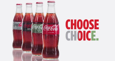
The colour scheme of red, green, black and grey with the main focus being on red. The white background brings attention to the pack shot of the product, further emphasising it to the consumer through the contrast of red and white. The USP is the colours and the drink used in order to make the consumer buy more of the product and become interested in the variety of flavours.
2) An example of a shocking or controversial idea (shock tactics):

Nike - Emotional appeal to the audience using a poignant man, as well as typography that evokes emotion. The black and white effect might make the advert seem more dramatic and the text more effective in being emotional. The slogan and logo at the bottom (without mentioning the brand name itself) are instantly recognisable and might convince the audience to buy the product because it is so famous. The USP is the message of sacrificing and linking it with sports in order to create the message of emotion being associated with Nike.
3) An emotional connection with the audience:

This advert specifically uses the slogan and advertising to centre around the idea of family which might make the consumer feel emotional or more inclined to buy from the company due to the concept of togetherness and family in the advert. The chosen background of a house is typical and might make the family able to relate to the advert more than if it had been simply blank, for example. The USP is the idea of family linked with McCain in order to depict the message of a household and associating it with their brand in order to create an emotional appeal.
4) An innovative or subversive concept:

This advert is using a different concept - mould - to emphasise the point of "no artificial preservatives" being communicated to the consumer. The logo is featured beside the burger in order to associate the two, and the healthiness of the burger and products is also demonstrated, which might convince the audience to purchase from the company. The black background contrasts with the burger in order to also emphasise the pack shot of the product. The USP is the natural idea that the burger has no unnatural ingredients that can make it seem more interesting or appealing.l
5) A foreign advert that can be understood despite the language barrier:
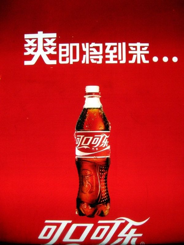
This advert features a recognisable brand and logo, which means that the advert can be understood despite the language barrier. In addition, the colours and typography accentuate the product and brand, despite not being able to be understood due to the language barrier. The USP is the drink, a pack shot of which is presented in the middle of the advert and instantly draws the consumers' attention.
Comments
Post a Comment